not your mama’s buttons
Buttons can be a nugget of inspiration, a medium to display your creative ability, or just random bits of colorful imagery. For designers, “icons can communicate ideas in your design projects. They can communicate ideas through your buttons as well.” smashingmagazine.com
Buttons are a transportable fun that we can carry pinned to our laptop case, purse, or jacket. Buttons are like tokens of our childhood. They are reminiscent of the playing cards we would trade, or the stickers we would place on everything.
I noticed a one of my classmates carries a bag-buttons clinging to the side-with her to class everyday. She is an illustrator, some of the buttons are her own creations. The buttons one chooses to pin to his or her belongings tells a lot about a person. “Buttons are powerful because they show what is important to the person wearing it, which ideas he or she supports and what kind of a person you are dealing with. Some buttons can make people pass away with a subtle smile, the other ones can send a message to the world, and as such, pose a very powerful medium to explore.” smashingmagazine.com
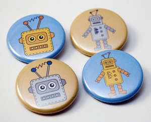
buttons
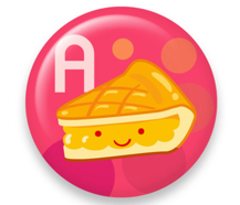
button
packaging design
The design of a package can make or break a product. An intriguing design will catch the eye of a consumer. “Package designs can simply inform the customers, but also provoke feelings and communicate emotions. An effective packaging looks attractive, impresses with its creativity and is just nice to have on the shelf.” -Smashing Magazine smashingmagazine.com
A re-design of the Monopoly board game, by Andy Mangold andymangold.com, speaks to a new generation of board gamers. The design is not actually for sell, as it has not yet been approved by Hasbro. The previous design is flooded with the color wheel, while the new design is more monochromatic, separating itself from the usual color overload board game. If this design were sold on store shelves, it would definitely be eye-catching next to its’ “rainbow rivals.”
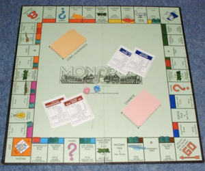
old Monopoly design
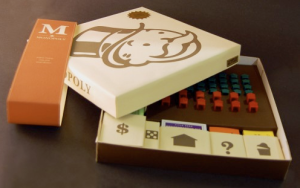
new Monoploy design Dec 08
An example of a product totally reliant on its’ package design is Vitaminwater. “There are 13 grams of sugar in one serving, so an entire bottle contains about 32.5 grams of sugar. For the sake of comparison, a can of Coca-Cola Classic contains about 39 grams of sugar. Because the sugar found in Vitaminwater or Coke is made from a refining (or purifying) process, it contains no nutrients or vitamins beneficial to our health. There are indeed a variety of vitamins in any flavor of Vitaminwater, but it seems the vitamins’ benefits are offset by the effects of sugar.” howstuffworks.com Vitaminwater is a very popular drink, and a perfect example of an “enhanced water” that is sold based on top-notch advertising and packaging, seeing as the water is not especially healthy.
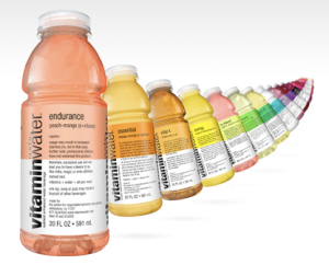
vitaminwater
t-shirt design
A t-shirt design site I have been following lately is, rediswhite.com. The site allows designers to upload faith inspired shirt designs. The designs are then judged by members of the site, and the winning designs are then printed and sold to the public. The designs that have been posted range from poor design-possibly created in word by a secretary, to excellent design-created by an experienced designer. The company is in the beginning stages, and I’m hoping to see more sweet designs on display under the rate tab. Many of the designs, I’m convinced, were not thought-out properly-from placement to type choice. Other designs, nicely designed shirts, earn their place in the shop.
A t-shirt was one of the first mediums I worked with outside of school. I had no previous experience in shirt design. The shirt canvas was something I was unfamiliar designing for, but embraced the challenge. Thoughtful placement of various graphics is very important, seeing as it covers the human body. One design on RiW I was surprised made it to the shop, was the orange “finger paint” like hand. The design, I believe, does not belong on a female shirt. Take a look at the photo below, and you may agree. I don’t know many women that would wear this shirt in public, unless they wanted odd glances from the people around them.


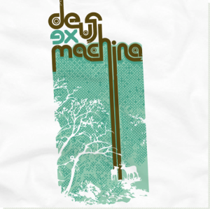
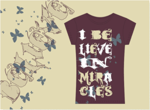
nicely designed/poorly designed
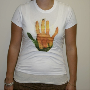
placement!!
Portfolio Website
When assigned to create our own portfolio website, I was elated. A graphic designer with a website is a must in order to get your name and work out there for people to see. Having already completed my self-branding, I immediately had a color scheme and layout in mind. In keeping with the simplistic design of my self-branding work, I chose to design the website with few visual distractions. Overall, the website is easily navigated and visually sound. I plan on spending the remainder of the Summer fine-tuning the site and adding more pieces to my portfolio page.
Pop Tarts Package
When I received the project specs, I was excited about the challenge
ahead. I didn’t realize just how much of a challenge creating a website based off
of a Pop Tarts package was going to be. I read over the information on the package
to get an idea of what information I wanted on each page. From there, I
sketched thumbnails and created grey boxes in order to begin creating the initial
draft. After a few ideas for the site, I decided upon a blue and brown color
scheme. The feel of the site is calm and a nice contrast to the loud and colorful
Pop Tarts package.
web accessibility and web standards
The web is a wealth of information for everyone to gain access to. The web accessibility standards allow users, regardless of disability, to obtain this information with little or no difficulty. Various sites are designed for specific users with disabilities. For example, a blind person would be able to access a standard site with ease using a page reader. It is important to code the information for the site correctly so the page reader reads the information correctly. When it comes to web standards, W3C is the website to go to for a complete list of website rules. The rules consist of proper (x)html markup, style sheets, and accessibility. Web accessibility and web standards go hand in hand. Web standards, when followed ensure accessibility for all, on the World Wide Web.
Chattanooga Times Free Press
Frank Anthony gave the class a tour of the Chattanooga Times Free Press facility, during which we were allowed to walk throughout the flexography printer. As a result of using the flexography printer, the ink is rub-free, in which the Chattanooga Times Free Press prides itself. The press is run around the clock in order to guarantee the Chattanooga area a daily newspaper.
printer guide
The project began with each student assigned to present two local print shops. After the presentations, we created a print guide, each page a different printer. I designed a page for Modern Way Printing and The Silkscreen Printing Co. The Modern Way page is mainly type driven, whereas the Silkscreen Printing Co. page is more of an emphasis on the image.
volume through volume
The class was given an assignment by AIGA to design a vote poster and correlating pin for the 2008 presidential election. The goal was to appeal to designers in AIGA50. The posters were a call to action, register and vote. I created 2 posters to be used within series, which could be increased to 5 or more posters. The posters appeal to the artists, each character is holding an instrument used in designing process.
word pairs
The assignment consisted of taking a pair of words, opposite of each other, and relating their differences through imagery. The words assigned to me were old and new. I chose to take my own photos and integrate them into the design. Old is described with a photo of the inside of an old piano. New is described with a photo of a brightly colored orange flowered cactus. The imagery is nicely done, with intriguing lighting and composition.